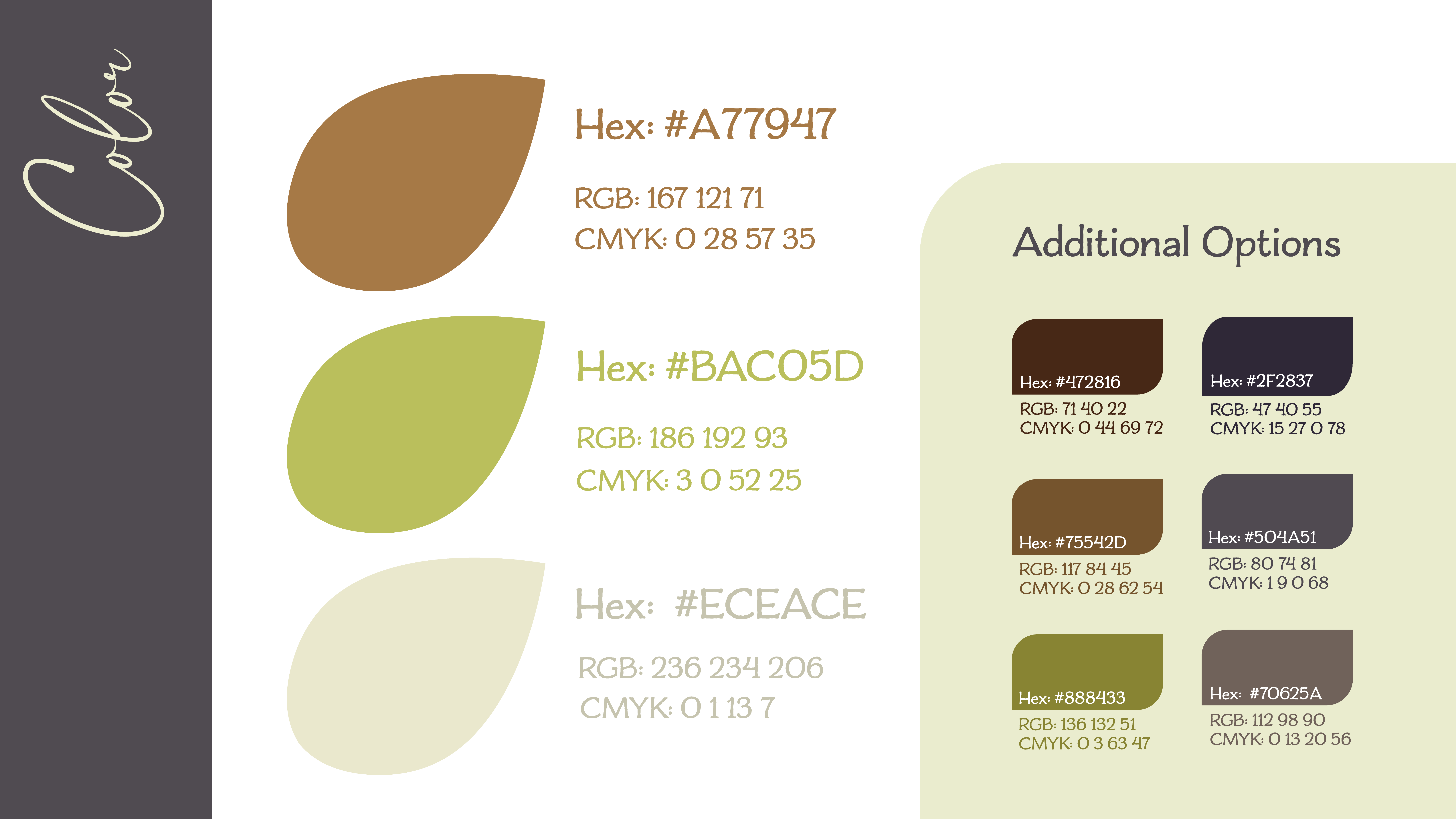
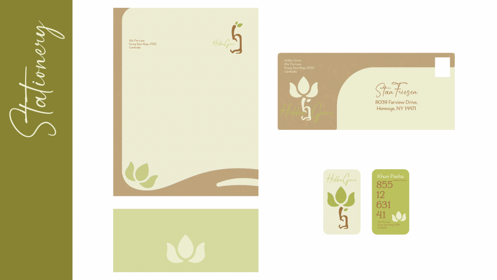
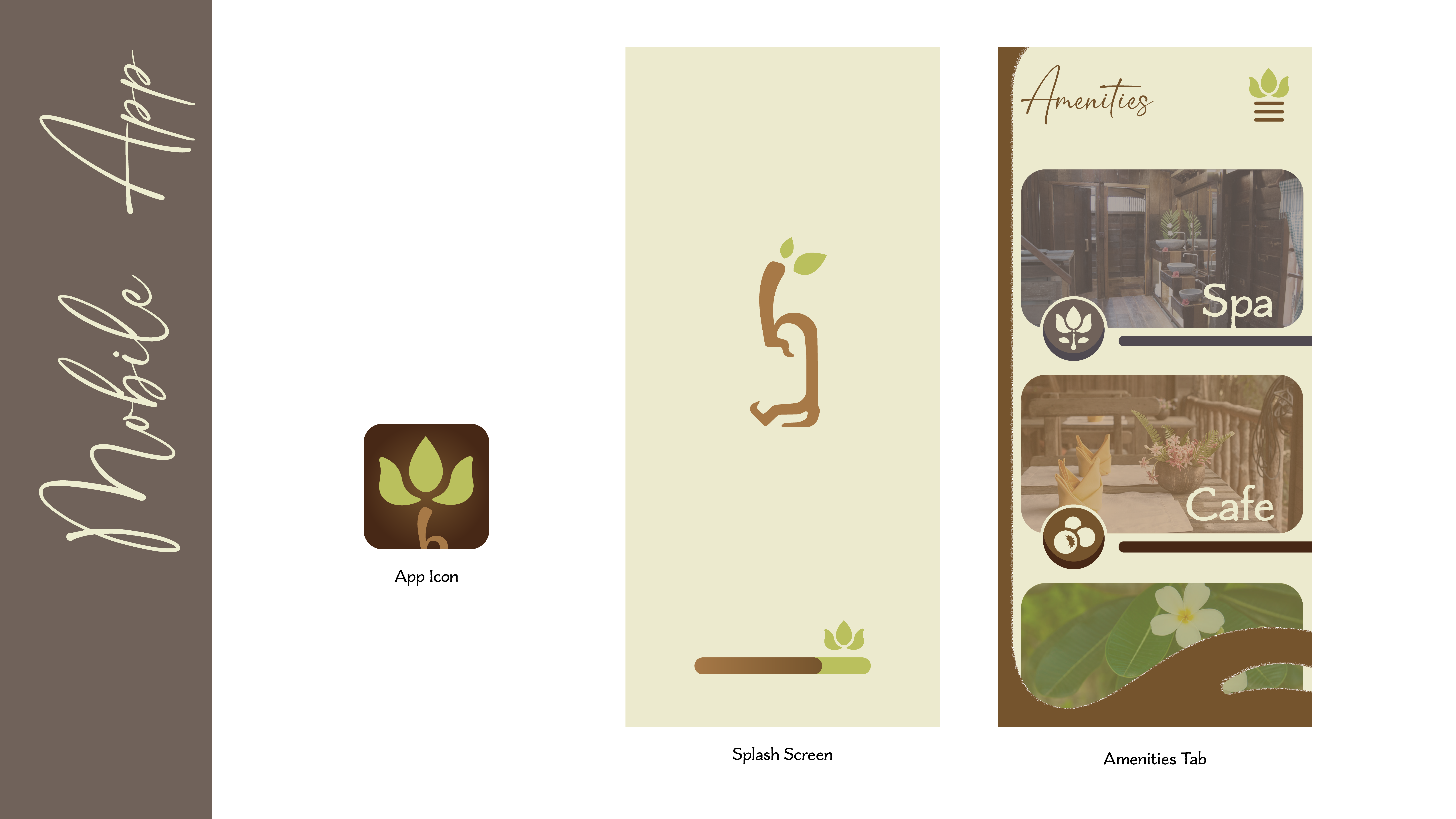
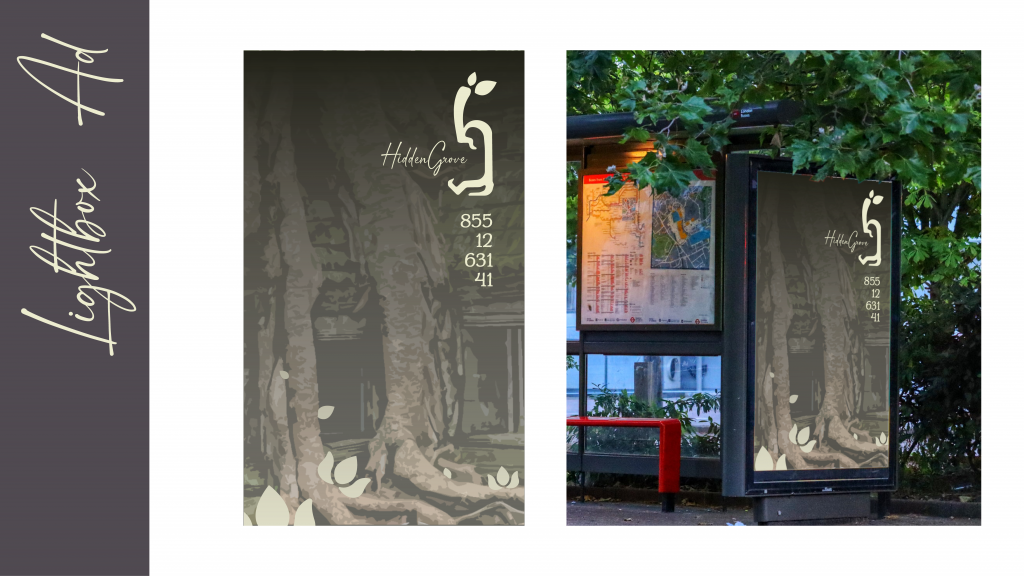
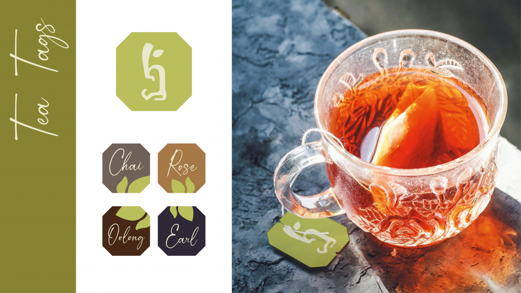
A rebranding project based on a resort in Krong Siem Reap, Cambodia.
![](https://natbak.com/wp-content/uploads/2023/02/SLides-02-1024x576.png)
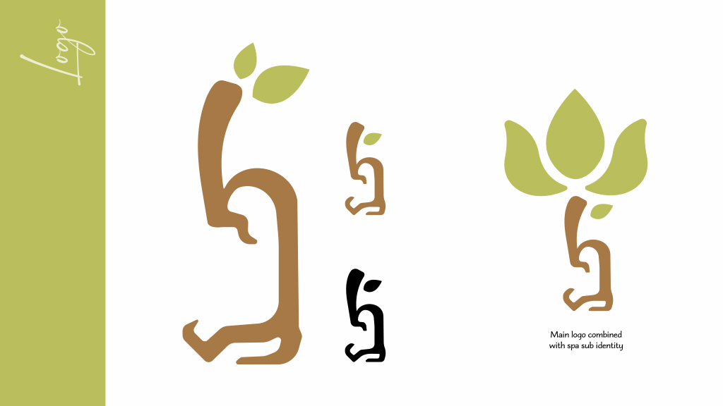
The final logo was inspired by the tree roots that have overtaken many ancient religious sites in the region. The shape hints at an h and a g to bring the name into the design as well.
![](https://natbak.com/wp-content/uploads/2023/02/slide-05-1024x576.png)
![](https://natbak.com/wp-content/uploads/2023/02/SLides-11-1024x576.png)
![](https://natbak.com/wp-content/uploads/2023/02/SLides-13-1024x576.png)